aaronnhall.wix.com/kooks
KOOKS WAREHOUSE:
In my design of the website, the objective was to make an artifact that was easily navigable and visually appealing. The website follows the guideline of the style guide, mostly relying on neutral colors. In each page, everything rests around the center of the page, creating a symmetrical feel. This felt more fitting as opposed to a strong grid layout. This also helps so it's easier to navigate on mobile devices.
On each page, the company logo is displayed on the top of the page, and points down to lead you to the rest of the material. A flat row of page links rests right below the logo. In the axioms of web design, it's mentioned that the area of most contrast is the area where you want to draw the majority of your focus. This, obviously, was in the body of each page below the navigation menu. Black text was placed against a white background, in addition to colorful photos.
In terms of the content of each page, each text box was written to have a conversational feel to it. This was meant to bring the reader in and help them feel like a friend, or soon-to-be friend.
Thursday, April 30, 2015
Tuesday, April 28, 2015
Final Presentation: Kooks
Everything you'll need is on the website. Ben made the video on the homepage, I designed the site itself and outfitted it to be compatible with mobile devices, and all of Matt and Rachel's work is included on the "GROUP STUFF" tab. Thank you!
aaronnhall.wix.com/kooks
aaronnhall.wix.com/kooks
Thursday, April 2, 2015
Mise-en-scene Presentation: Edward Scissorhands
DIRECTOR OF PHOTOGRAPHY

The eerie feeling is obtained through a lot of the tracking shots in the courtyard. The wide lens, when focused on an object in close proximity, almost makes the subject seem to bubble out from the center of the frame. It's very subtle, but effective. The DP creates a feeling of eerie wonder through this use.
Secondly, the wide-open feeling needs to be explained because of the context of the film. As you can see from the shots below, the castle is among some prim, way-too-perfect homes in a suburban neighborhood. The citizens match them perfectly. Even though they live these perfect lives, Edward, who lives in a creepy castle on a nearby hill, is by far the most innocent character in the whole movie. So this challenges our perspectives on what's considered good and innocent. We need to keep our eyes open to what may be whole and beautiful, because it may be behind an ugly mask.
As for the lighting, a lot of lighting in this scene comes off as very natural. Even the castle is mostly illuminated by natural light, seeping through windows or gaping holes in the ceiling.

 |
| Distortion through wide lenses and camera movement create a fantasy-like feeling. |
 |
| Peggy is framed very tightly by other objects in the frame, making the audience feel restrained and uneasy. |

A very cool camera movement exists between these two frames. Peg backs into the frame, looking small and vulnerable in front of this creepy statue, her figure just visible above the hips. When she hears Edward upstairs, the camera tracks to the right and cranes upward as she ascends the staircase. It ends with a wide shot of the whole staircase.


Again, natural lighting floods the floor, also representative of Edward's unfinished body.

Natural lighting is used as a backlight as Edward hides in a corner, so his entire body is silhouetted. It's not until he slowly creeps out into the foreground that the lighting from the bigger hole illuminates him, so we actually see who he is.

Thursday, March 19, 2015
Christopher Nolan is all that, but not a bag of chips.
If you would have asked me who my favorite director is before I saw Interstellar, I would have told you it was Christopher Nolan. His Dark Knight trilogy, Inception... fantastic films. He has a real knack for storytelling and writes scripts that aren't just meant to entertain, they force you to pay attention and to think. I consider Inception my favorite all-time film because every aspect of production was so phenomenally executed, from the screenplay to the sound editing. I'll argue vehemently with anyone who feels otherwise.
However, I feel that Nolan was trying a little too hard with Interstellar. It's a great film, but I simply wasn't blown away as I usually am with most Nolan films. I feel like it tried too hard to be scientifically accurate while still punching your feels in the jaw, but it didn't quite work. You disappointed me a little bit, Chris. You're not a perfect filmmaker, despite what you may think.

I love Jared Hess films for the exact opposite reasons. Hess is the awkward artistic vigilante behind comedies like Napoleon Dynamite and Nacho Libre. It's obvious that Hess doesn't take himself too seriously with the brand of films that he puts out. They're hilarious, quotable, and involve awkward symmetrical shots and zoom lenses. Not to mention he has an affinity for creating likable and dorky protagonists. I think a lot of directors would do well to take a leaf from Jared Hess' book. Yeah, it's great to have our artistic, norm-challenging films raking in Oscars every year... but come on. Don't take yourself so seriously.

Monday, March 16, 2015
Compose Your Frame Assignment
 |
| f/3.5, 1/1250 s, ISO-100, 18mm |
In this photo, the rule of thirds applies because our eyes are instantly drawn to the chairs, one of which is hovering near the bottom-right corner of our invisible tic-tac-toe grid. The vertical lines in the top of the structure also end on the top part of the tic-tac-toe grid. We have diagonal movement from those chairs and the narrow beams running across the ceiling of the structure. This also creates depth--our eyes want to travel along the path where the beams and chairs point. From this perspective, it might even be infinite.
Wednesday, March 4, 2015
Axioms of Web Design
http://www.johnnycupcakes.com

No, it's not a bakery--even though he tries to make it look like one. Johnny Cupcakes makes apparel.
I love Johnny Cupcakes. I love the t-shirt designs and the story behind the brand, and the website is fantastic. It's lively, easy to navigate, and there is always something new.
First off, navigating the site is simple. Everything you need is on the right side of the top bar. You've got your SHOP, which is where you'll spend most of your time browsing, BLOG, which is updated almost daily, BAKERIES (locations), EVENTS, and ABOUT, which gives the story of Johnny and the brand he's concocted. There's really not much else to the website--simple.
It also utilizes Rutledge's strong grid well. What's placed in the grid? Shirts. Keychains. Stickers. Products you can buy. And the products offer some great contrast against the solid white background, making them pop. And are there aesthetically pleasing designs? Absolutely. Just tell me these shirts don't look cool.
Admittedly, the design doesn't motion the eye down an angle of any sort. It kind of allows your eye to roll down, from the massive banners to the products below. It makes you pause to scan everything that's going on the screen, which is typically a lot.
Recently, the folks at JC also made sure the website works well on mobile. Johnny actively updates Instagram and Snapchat with what's going on in the company, and it was through those social networking platforms that I discovered they had revamped the mobile website interface. It now runs exceptionally smooth.
Tuesday, February 10, 2015
Good Design, Not-So-Good Design
 |
| Good Design |
Here we've got two movie posters that represent some good design, and some not-so-good design.
For good design, we have the iconic poster for Raiders of the Lost Ark. This film is a classic. You can tell from Indiana Jones' kinetic power stance that this is going to be an adventure film. It also takes place in the Middle East, which is illustrated by the design's sand-blown appearance. The proximity of the supporting cast's portraits (each with dramatic lighting) frame Jones as the center of attention, and you've got subtle motifs near the edges that represent elements in the story, too, such as snakes and ancient temple designs. They gather around the edge of the frame in a circular motion, creating continuity for the eye.
 |
| Not-so-good Design |
In terms of not-so-good design, we've got the poster for The Last Crusade, the third Indiana Jones film. The poster includes closure in terms of framing in a loose photo of Jones facing the audience. There isn't much to stay in terms of continuity because the eye doesn't have very far to go--Jones is kind of boxed into a smaller frame within the poster. The white border also clashes with the warm tones of the inner photo. Overall, this design feels restrictive and stifled.
Tuesday, January 20, 2015
Contrast, Harmony, and Balance
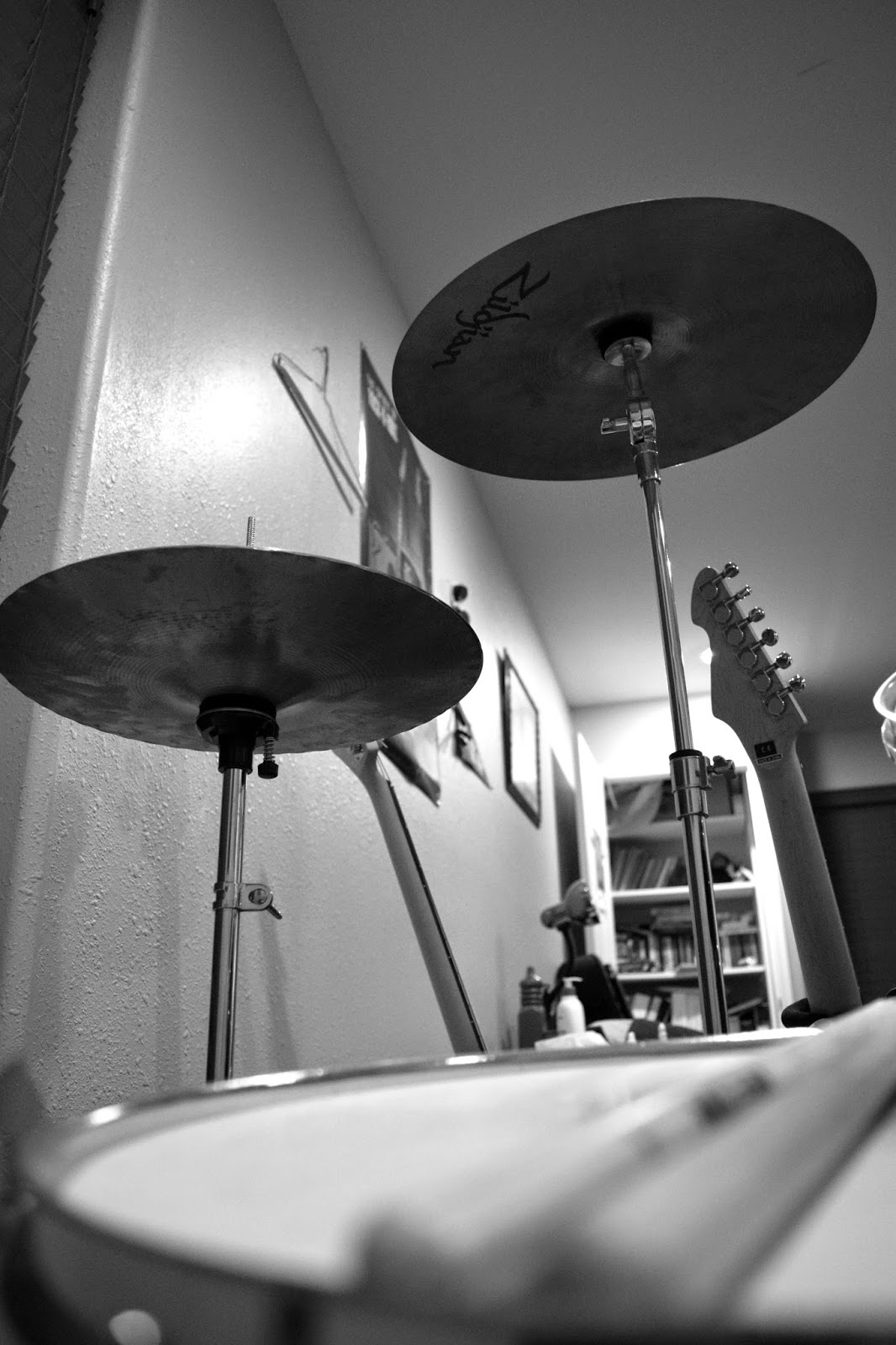
In terms of contrast, we've got a fairly wide range of shades that span from the dark shades of the window blinds to the light that's on in the corner of the room, which reflects off of some points of the walls. The balance is asymmetrical due to the different heights of the cymbals. The hi-hats sit a little lower in the frame while the crash rises nearly to the top-right corner. The harmony of the photograph is illustrated by the musical instruments repeating as your eye travels deeper into the photo. The snare and drumsticks lay the foundation at the bottom of the frame, followed by the asymmetrical cymbals, which are in focus, leading by two guitar necks and the rest of the room.
An Experience of the Visceral Variety
.jpg)
I'm not a connoisseur when it comes to paintings, but from what I do know about paintings, I love Jackson Pollock's work. Among his works, I'd have to say "Blue Poles" is my favorite.
I think true beauty is found in imperfection, and "Blue Poles" is a chaotic mix of yellows, blues, and whites that comes together in what looks like a mess of imperfection. There is a messy bombardment of curving, diving, and swirling lines except for the eight blue "poles" that protrude nearly vertically throughout the piece. What is negative space? What's positive space? In this piece, it's tough to tell, and I like it. As for texture, the globs of paint are laid on so thick that it almost creates its own milky, bubbly feel that's enforced by the fact that the canvas cannot be seen at all.
What's the feeling that his piece portrays? With the vertical blue lines, it almost seems to communicate attempted order among disarray. And isn't that what we're all striving for in life?
Subscribe to:
Comments (Atom)